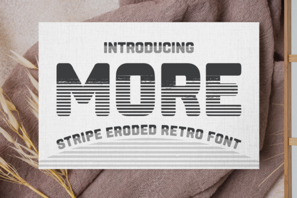
More: A Bold Vintage Display Font That Commands Attention
It’s 10:47 a.m. on launch day—and I’m squinting at my phone screen, scrolling through Instagram previews of our new seasonal content series. The first three thumbnails blur together: clean, competent, but forgettable. Then—there it is. A bright coral background with crisp white text reading “Summer Starts Now.” The headline isn’t just read—it’s felt. That’s More.
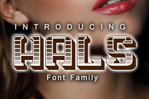
More isn’t subtle. It’s a display font built for impact—bold, slightly condensed, with vintage charm that nods to mid-century signage and hand-painted shop fronts. Think confident letterforms with strong contrast, subtle flares on terminals, and a rhythmic confidence in every uppercase “M” and “R.” It doesn’t whisper. It leans in, makes eye contact, and says what needs saying—without needing extra words.
We used More across six core campaign assets: YouTube thumbnails, Pinterest pins, Instagram Reels covers, email banners, a Shopify promo banner, and a set of branded quote graphics for Stories. In each case, it served the same strategic role: instant recognition in under one second. On mobile, where attention spans shrink and scroll speeds increase, More’s high x-height and open counters kept readability sharp—even at 28px over a textured background or against a gradient overlay.
Here’s what worked best:
- Sale announcements: “50% OFF — ENDING SOON” in More, paired with a tight sans serif (like Inter or DM Sans) for body copy—clear hierarchy, zero ambiguity.
- YouTube thumbnails: Used at 48–60px in white with a subtle drop shadow on dark backgrounds. No stroke needed—the weight and shape held up even when compressed or scaled down.
- Pinterest pins: Paired with a warm serif (Cormorant Garamond) for subheadings. The contrast gave editorial depth without sacrificing scannability.
- Reels covers: Short labels only—“NEW”, “FREE”, “JUST DROPPED”—in all caps. The vintage flair added personality without feeling dated, especially next to modern product shots.
- Email banners: Set at 36px on light backgrounds, 40px on dark. Tested across iOS Mail, Gmail, and Outlook—no rendering hiccups, thanks to solid OpenType support and clean hinting.
More shines brightest as display text—not body copy, not captions, not long paragraphs. It’s designed for moments where your message must land before the viewer decides to keep scrolling. That means headlines, logo-style treatment, campaign tags (“Limited Edition”, “Early Access”, “Coming Soon”), and decorative titles in editorial layouts or digital ads. It’s not meant to be neutral. It’s meant to anchor.
Readability on small screens? Solid—but with nuance. We avoided thin weights (not included in More anyway) and stuck to its primary bold weight for maximum legibility. On dark backgrounds, we added a soft 1px white stroke only when needed—never as default. For fast-scrolling feeds, we kept line length tight (under 30 characters per line) and always tested thumbnail crops on both iOS and Android preview tools. No surprises.
Font pairing was intuitive. Our go-to was a clean, highly legible sans serif—something with generous spacing and neutral tone—to balance More’s expressive energy. Inter, Poppins, and Manrope all worked beautifully as supporting typefaces for body text, buttons, and captions. For more editorial or lifestyle campaigns, we layered in a gentle serif like Lora or Playfair Display for subheads—letting More hold the spotlight while other fonts handled nuance and flow.
We did skip pairing it with script or handwritten fonts in this round—too much personality collision. More already carries strong voice and character; adding another expressive layer risked visual noise instead of harmony. That said, in a playful brand campaign (think artisanal goods or retro-inspired apparel), a single-line script accent—used sparingly, like a tagline flourish—could complement it well.
Before locking in More across all assets, we double-checked the file package: OTF and WOFF2 included, full Latin character set, standard punctuation, numerals, and basic diacritics—enough for English, Spanish, French, and German campaign variations. No extended Cyrillic or Arabic support, so we noted that for future global tests. Licensing was clear: commercial use permitted across digital ads, client work, templates, and merch—no hidden restrictions. We verified embedding permissions for our Shopify theme and email platform, too.
What surprised us most wasn’t how More looked—but how it behaved in context. It didn’t just add style. It tightened our messaging. When the headline font carries authority and warmth in equal measure, the supporting copy doesn’t have to over-explain. “New Collection Live” becomes an event—not an update. “Free Guide Inside” feels like an invitation—not an offer.
In a feed full of polished-but-identical visuals, More gave our campaign a tactile, human signature—like chalk on a bodega window or hand-lettered signage outside a neighborhood café. Not nostalgic for nostalgia’s sake, but rooted in real visual language people recognize and trust.
If you’re building a campaign where clarity, speed, and memorability matter—whether it’s a webinar series, product launch, holiday sale, or content refresh—More earns its place not as decoration, but as a functional design decision. It’s the kind of display font that doesn’t ask to be noticed. It simply is—bold, grounded, and unmistakably present.